Buttons
Large Buttons
Simple Primary Success Information Warning Danger LinkSmall Buttons
Simple Primary Success Information Warning Danger LinkExtra Small Buttons
Simple Primary Success Information Warning Danger LinkButtons With Icons
There are a number of icons that can be added to a button.
Donate Now Our LocationFull Width Buttons
Create block level buttons—those that span the full width of it’s containing element—by selecting the make block option.
Default Primary Success Information Warning DangerHow to Add a Button
- Place your cursor in the location where you wish to add the button.
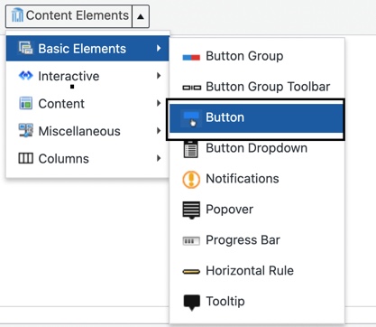
- Select Button from the Content Elements dropdown menu, under Basic Elements.
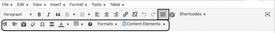
- If you don’t see the Content Elements Plugin button, (as shown in the step above), click the Toolbar Toggle button. The Toolbar Toggle button shows and hides a collection of buttons in the editor.
- Once you have clicked on the button shortcode option, a dialog box will appear that allows you to style your button.
- Style – The style options all correlate to the color of the button. There are 7 color options:
- Simple = White button
- Primary = Dark blue button
- Success = Green button
- Information = Light blue button
- Warning = Yellow button
- Danger = Red button
- Link = Clear button
- Size – select which size button you want
- Type – leave set to Link so you can add a url the button will link to.
- Select Icon – you can select an icon to add to the button
- Icon Alignment – you can align the button to the left or right of the button
- Icon Color – make sure you select a color that has plenty of color contrast
- Make Block – the button will expand to the full width of its containing element (the content area of the page, the width of a column or whatever the button sits inside. It also forces the button to sit on it’s own line. In other words, nothing else can sit on the same line as the button (even though it may appear that it can in the editor). You can use this option to make your buttons a uniform size.
- Title – add the text you want displayed on the button here.
- Link – replace the pound sign (#) with the url the button will link to.
- Custom Class – dark and light versions of our buttons are available.
- Add btn-light to the Custom Class field to get the light version of any button.
- Add btn-dark to the Custom Class field to get the dark version of any button.

- Style – The style options all correlate to the color of the button. There are 7 color options:
- Click the Insert Button button and the button shortcode will be added to the page.
Alternate Color Options
Light and dark versions of our buttons are available. To use these options, insert btn-light or btn-dark in the Custom Class field when generating the shortcode for a button.
Light Buttons
These buttons should be displayed on a dark background to ensure adequate contrast between the buttons and the background color.
Dark Buttons
These buttons should be displayed on a light background to ensure adequate contrast between the buttons and the background color.
Examples
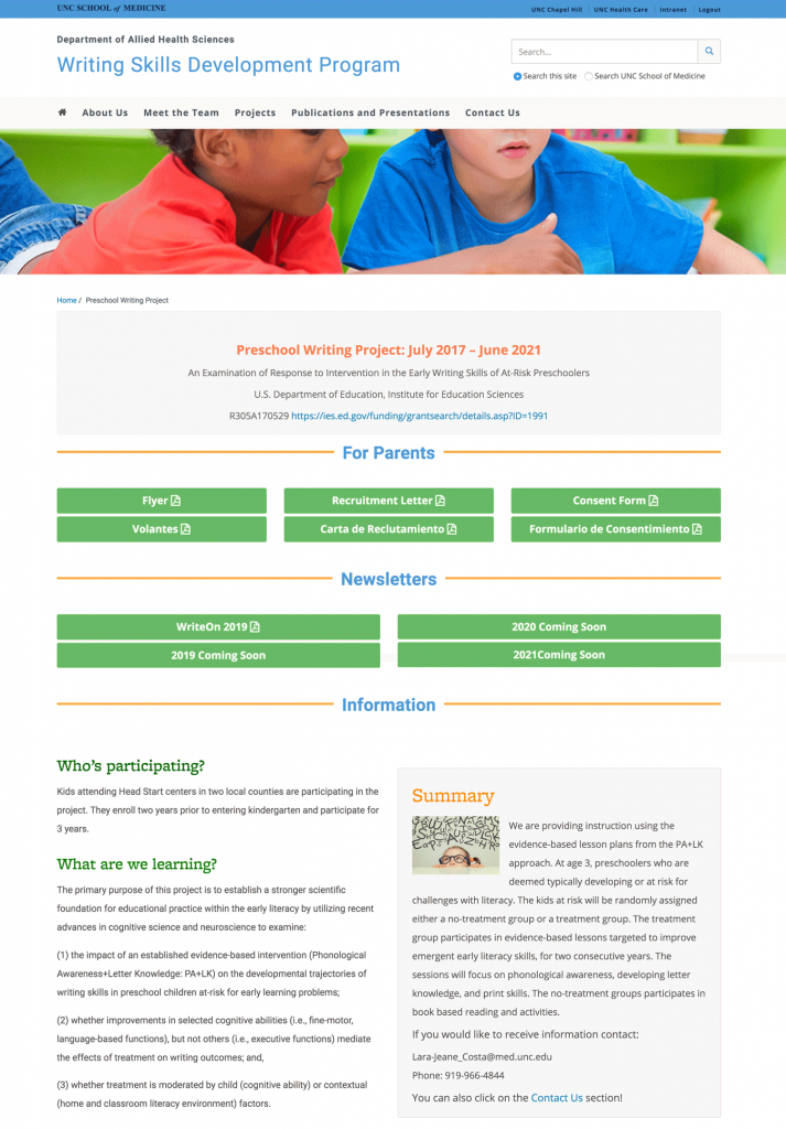
Writing Skills Development Program
They use columns to create the two and three column layouts and then placed multiple buttons in each column. They used the Make Block option to make the buttons a uniform size. See this example live on the Writing Skills Development Program web site.
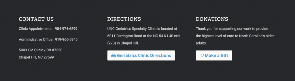
Center for Aging and Health
They use white buttons in the footer of their site. See this example live on the Center for Aging and Health web site.
Department of Psychiatry
They use several orange buttons on the body content of their home page as well as blue buttons in their site footer. See this example live on the Department of Psychiatry web site.